


New Shirt Design!?!

Thread Starter
www.Redline-Xtreme.com


Joined: Oct 2002
Posts: 3,195
From: Tampa, FL

New Shirt Design!?!
Here is a rough draft of a shirt design made possible by SCRAP at SYCINK . Trying to gear something for not only stunters, but your average everyday rider as well. Let us know what you think...obviously the quality will be much better...but this will give you a general idea.
FRONT:

BACK:

The Actual Back Design:

FRONT:
BACK:
The Actual Back Design:
Last edited by RedlineJimmy; Aug 9, 2004 at 05:18 PM.



Registered User

Joined: Dec 2003
Posts: 997
From: Las Vegas
Re: New Shirt Design!?!
I LOVE the design on the back! That is SO P IMP!!!!
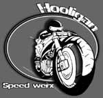
If it were my decision I would replace the front graphic of the guy on the bike because people that aren't cool like us might not know what it is!
IMP!!!!If it were my decision I would replace the front graphic of the guy on the bike because people that aren't cool like us might not know what it is!
Last edited by xAshleyx; Aug 9, 2004 at 07:07 PM.
Thread Starter
www.Redline-Xtreme.com
Joined: Oct 2002
Posts: 3,195
From: Tampa, FL
Re: New Shirt Design!?!
Originally Posted by JessesFanGirl
Oh yeah and it'd be pretty badass if the girl's tanktops could have the "NOT ALL COPS LIKE DOUGHNUTS" design on the front! Do you have a design for the girl's tops?
Registered User
Joined: Dec 2003
Posts: 997
From: Las Vegas
Re: New Shirt Design!?!
Originally Posted by RedlineJimmy
That would be way too loud for your average girls tanktop. Most girls just want a basic logo on the front and nothing more. If you really want it though I am sure we can get one made up for you.
Thread Starter
www.Redline-Xtreme.com
Joined: Oct 2002
Posts: 3,195
From: Tampa, FL
Re: New Shirt Design!?!
Originally Posted by JessesFanGirl
I LOVE the design on the back! That is SO PIMP!!!!
If it were my decision I would replace the front graphic of the guy on the bike because people that aren't cool like us might not know what it is!
IMP!!!!If it were my decision I would replace the front graphic of the guy on the bike because people that aren't cool like us might not know what it is!
* SCRAP, is there anyway using either white or red to help make Jesse's shilloute more distinguished. For instance, making the wheels stand out more by adding in the rims with either the white or red (Preferably Red for the white shirt)outlining. If not...no big deal....just curious to see what it would look like. Thanks!
Last edited by RedlineJimmy; Aug 10, 2004 at 02:19 AM.
Registered User
Joined: Dec 2003
Posts: 997
From: Las Vegas
Re: New Shirt Design!?!
Originally Posted by RedlineJimmy
* SCRAP, is there anyway using either white or red to help make Jesse's shilloute more distinguished. For instance, making the wheels stand out more by adding in the rims with either the white or red (Preferably Red for the white shirt)outlining. If not...no big deal....just curious to see what it would look like. Thanks!
Thread Starter
www.Redline-Xtreme.com
Joined: Oct 2002
Posts: 3,195
From: Tampa, FL
Re: New Shirt Design!?!
Originally Posted by JessesFanGirl
Good idea! I just think it's hard to tell what it is right now. Needs somethin!
 .
. 
Registered User
Joined: Dec 2002
Posts: 193
From: Tampa, FL
Re: New Shirt Design!?!
OK, how's this work for yous? I had to play around with some stuff in order for it to work well. The original picture was to much a front angle to outline the wheels. So I had to morph a couple pics together.

Registered User
Joined: Dec 2002
Posts: 193
From: Tampa, FL
Re: New Shirt Design!?!
OH, and Jimmy, for what it's worth. The website you are linking the shirt mock ups from. When you actually go to have the shirts made, find an actuall screen printer. DO NOT!!! use these places that offer print on demand. I know it sounds good in theroy and all. No money upfront and all that, but they're crap. Basiclly, what you're getting is iron on T shirts. I had the same idea and went through a similar company. They come out like crap and the images don't last more then a couple times through the wash. If you want, I can show you a couple heat transfer shirts I picked up not to long ago at a car show. If you don't wash them a certin way after they go through the wash 3 or 4 times the image gets extremley faded and blotchy. You'll have people bitch'n about them inside of month.
Thread Starter
www.Redline-Xtreme.com
Joined: Oct 2002
Posts: 3,195
From: Tampa, FL
Re: New Shirt Design!?!
Originally Posted by Scrapyard
OH, and Jimmy, for what it's worth. The website you are linking the shirt mock ups from. When you actually go to have the shirts made, find an actuall screen printer. DO NOT!!! use these places that offer print on demand. I know it sounds good in theroy and all. No money upfront and all that, but they're crap. Basiclly, what you're getting is iron on T shirts. I had the same idea and went through a similar company. They come out like crap and the images don't last more then a couple times through the wash. If you want, I can show you a couple heat transfer shirts I picked up not to long ago at a car show. If you don't wash them a certin way after they go through the wash 3 or 4 times the image gets extremley faded and blotchy. You'll have people bitch'n about them inside of month.
I'm still leaning towards the old one, but can we see the new one without any red in it or red brush strokes. Just got another idea too....what about the original shilloute in gray scale(black and white).?.
Last edited by RedlineJimmy; Aug 10, 2004 at 04:36 AM.

I Enjoy Posting At StuntLife!
Joined: Oct 2002
Posts: 1,395
From: tampa
Re: New Shirt Design!?!
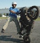
To be completely honest I am not digging the silhouette. It puts everything off center. The other thing is there are a lot of other stunt teams out there using silhouettes on their shirts and logos already. The back of the shirt is an original design, I think the front should be original also.
Dav
Dav
Registered User
Joined: Sep 2002
Posts: 2,456
From: Ex-NY, Ex-FL, now in Elkton, MARYland.
Re: New Shirt Design!?!
Nice job, the front logo is pretty nice with or without the silhouette and also with or without the redline tach outline as well, I think either way you make it, it works. None of those slight changes you made makes it stand out as something I wouldn't buy over if it was designed a different way.
Now for the bad news....
Although it looks like Jimmy's bike and the overall design is different, the back logo of the burnout and the "Not all cops like doughnuts" is something I saw up here last year, it was at a bikeshow or a shop, I can't remember but I do know I saw it cause I laughed out loud. I still like it, it kicks ***. It may have been spelled donuts, like the way they spell it for Dunkin Donuts, or it may have been very slightly different wording. I'd still do the whole design, I have never seen anyone actually wearing one so it obviously isn't that common. I just wanted to let you know since you have the whole "property of Redline" thing on there. The design is original though.
Send one up this way when they are done.
Now for the bad news....
Although it looks like Jimmy's bike and the overall design is different, the back logo of the burnout and the "Not all cops like doughnuts" is something I saw up here last year, it was at a bikeshow or a shop, I can't remember but I do know I saw it cause I laughed out loud. I still like it, it kicks ***. It may have been spelled donuts, like the way they spell it for Dunkin Donuts, or it may have been very slightly different wording. I'd still do the whole design, I have never seen anyone actually wearing one so it obviously isn't that common. I just wanted to let you know since you have the whole "property of Redline" thing on there. The design is original though.
Send one up this way when they are done.
Last edited by GSE_Anthony; Aug 10, 2004 at 10:07 AM.
Thread Starter
www.Redline-Xtreme.com
Joined: Oct 2002
Posts: 3,195
From: Tampa, FL
Re: New Shirt Design!?!
Originally Posted by GSE_Anthony
Now for the bad news....
Although it looks like Jimmy's bike and the overall design is different, the back logo of the burnout and the "Not all cops like doughnuts" is something I saw up here last year, it was at a bikeshow or a shop, I can't remember but I do know I saw it cause I laughed out loud. I still like it, it kicks ***. It may have been spelled donuts, like the way they spell it for Dunkin Donuts, or it may have been very slightly different wording. I'd still do the whole design, I have never seen anyone actually wearing one so it obviously isn't that common. I just wanted to let you know since you have the whole "property of Redline" thing on there. The design is original though.
Send one up this way when they are done.
Although it looks like Jimmy's bike and the overall design is different, the back logo of the burnout and the "Not all cops like doughnuts" is something I saw up here last year, it was at a bikeshow or a shop, I can't remember but I do know I saw it cause I laughed out loud. I still like it, it kicks ***. It may have been spelled donuts, like the way they spell it for Dunkin Donuts, or it may have been very slightly different wording. I'd still do the whole design, I have never seen anyone actually wearing one so it obviously isn't that common. I just wanted to let you know since you have the whole "property of Redline" thing on there. The design is original though.
Send one up this way when they are done.
Oh yeah, you may want to get your bike back from Elite...because unlike wine it doesn't become more valuable with age by sitting in the back cellar
. Registered User
Joined: Dec 2002
Posts: 193
From: Tampa, FL
Re: New Shirt Design!?!
Let's try this idea. We're gona change up a few things. First let's ditch the puny little line and add a bit more deffinition to the tach idea.

As far as the front of the shirt is concerned, let's get back to this whole simplicity thing. The siloutte does clutter things up a bit. It works for web based stuff were you can get away with more detail. But for print porposes, were people are gona more often then not take a quick glance at it, it's a bit destracting. Plus, you're gona have the bike theme on the back side of the shirt. So what you really want is to go for that simplistic eye catching logo up front and the big representative image on the back. Like so...

Stickers would be the same idea. You want to push your name first and formost.
As far as the front of the shirt is concerned, let's get back to this whole simplicity thing. The siloutte does clutter things up a bit. It works for web based stuff were you can get away with more detail. But for print porposes, were people are gona more often then not take a quick glance at it, it's a bit destracting. Plus, you're gona have the bike theme on the back side of the shirt. So what you really want is to go for that simplistic eye catching logo up front and the big representative image on the back. Like so...
Stickers would be the same idea. You want to push your name first and formost.

Registered User
Joined: Oct 2002
Posts: 54
From: Tampa, Florida
Re: New Shirt Design!?!
I like the last one scrap just posted with the logo smaller and centered in the shirt since the back is so detailed and large.
The back design is good for more general people as alot of people don't like cops and will thinks it's funny. I do think that once this shirt gets done and printed then the other shirts should get back to showing the newest stunts on it with each of the team's riders.
We are all out the the old girl's tanks that we had and the kid's shirts. I sold out quick on those at the last show in May. I would like to see the girls tanks in white with the same style/material tanks that we had, but update the logo on the front. They used to be red with black lettering, but I think Silver lettering would be cool. What do you think?
The back design is good for more general people as alot of people don't like cops and will thinks it's funny. I do think that once this shirt gets done and printed then the other shirts should get back to showing the newest stunts on it with each of the team's riders.
We are all out the the old girl's tanks that we had and the kid's shirts. I sold out quick on those at the last show in May. I would like to see the girls tanks in white with the same style/material tanks that we had, but update the logo on the front. They used to be red with black lettering, but I think Silver lettering would be cool. What do you think?


