


Hazen sucks....


CVBOYZ.COM

Joined: Oct 2002
Posts: 3,995
From: Montgomery, Vermont

Re: Hazen sucks....
Originally Posted by -Drew-
I need "CANNONDALE" in white vinyl, all caps, 14" long, 2.5" tall, in old english font. Gonna repaint my mtn bike this winter. I'd like two stickers for the down tube. Let me know if you can help with that.
Anything else?

Thread Starter
Registered User
Joined: Oct 2002
Posts: 4,030
From: Rochester, NY
Re: Hazen sucks....
Originally Posted by PhearCVBz
Yup, easy enough. If you have a specific font you need then let me know, otherwise I'll just use the old english fonts that I have.
Anything else?
Anything else?
Thanks dude. Try and send me the old english font you have in an email first, before you cut it please. Just so I can see if that's what I really want. Appreciate it bud!

Registered User
Joined: Oct 2002
Posts: 7,852
From: O-town FL
Re: Hazen sucks....
Originally Posted by -Drew-
Dude... what do you think about doing it TP style and keeping it wide open the entire run?
Thread Starter
Registered User
Joined: Oct 2002
Posts: 4,030
From: Rochester, NY
Re: Hazen sucks....
Originally Posted by Hazen
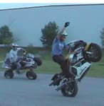
I don't have anything planned yet, but I'm gonna throw in every combo I can do, ALOT of burnouts / drifting (WFO), prolly a long coaster, some Zeros that I just learned, and am gonna work on christ variations tonight. :YEAH
Sounds sick. Drifting WFO =

What's a Zero?

Thread Starter
Registered User
Joined: Oct 2002
Posts: 4,030
From: Rochester, NY
Re: Hazen sucks....
Originally Posted by PhearCVBz
drew..any of these like you had in mind? could also do the cannondale logo or the font.
4th font down from the top is exactly what I was looking for! I'll take a couple of just the cannondale logo... not text... in white as well... probably about 2"?? Thanks dude! Just send me the bill.
CVBOYZ.COM
Joined: Oct 2002
Posts: 3,995
From: Montgomery, Vermont
Re: Hazen sucks....
Originally Posted by -Drew-
4th font down from the top is exactly what I was looking for! I'll take a couple of just the cannondale logo... not text... in white as well... probably about 2"?? Thanks dude! Just send me the bill.
PS....I have a funny feeling that font at 2.5 inches will be way bigger than 14" long. I can of course distort it to fit in that area, but it might look weird. I'll get you a proof soon.
Last edited by PhearCVBz; Nov 9, 2006 at 09:16 AM.
CVBOYZ.COM
Joined: Oct 2002
Posts: 3,995
From: Montgomery, Vermont
Re: Hazen sucks....
So the standard font at 14" is only 1.5 inches tall. If you stretch it to 2.5 inches it doesn't look too bad. Attached is what it would look like proportionally if it was 2.5 x 14. Obviously the finished product would have nice smooth edges.
Look okay?
Look okay?
CVBOYZ.COM
Joined: Oct 2002
Posts: 3,995
From: Montgomery, Vermont
Re: Hazen sucks....
Originally Posted by Hazen
That's sick. You gonna do it as a biz or just for fun???
I've had it for a few months now, but kept forgetting to mention it to anyone looking for stuff.

 Re: Hazen sucks....
 Thread Starter
Registered User
Joined: Oct 2002
Posts: 4,030
From: Rochester, NY
Re: Hazen sucks....
Originally Posted by PhearCVBz
So the standard font at 14" is only 1.5 inches tall. If you stretch it to 2.5 inches it doesn't look too bad. Attached is what it would look like proportionally if it was 2.5 x 14. Obviously the finished product would have nice smooth edges.
Look okay?
Look okay?
Looks good. But don't cut anything yet. I want to remeasure the area first to make sure I've got the right dimentions. Thanks again.
Registered User
Joined: Oct 2002
Posts: 7,852
From: O-town FL
Re: Hazen sucks....
Originally Posted by PhearCVBz
Well I bought it for my own personal use, but I'm doing stuff here and there for people I know just to help pay for my materials.

CVBOYZ.COM
Joined: Oct 2002
Posts: 3,995
From: Montgomery, Vermont
Re: Hazen sucks....
Originally Posted by -Drew-
Looks good. But don't cut anything yet. I want to remeasure the area first to make sure I've got the right dimentions. Thanks again.
Let me know if you can think of anything else you may need as well.


